Thursday, May 22, 2008

Rockin' Jelly Bean's Erostika anniversary posters


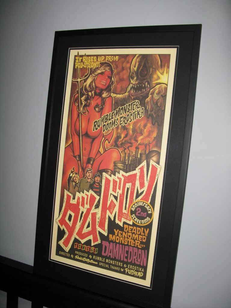
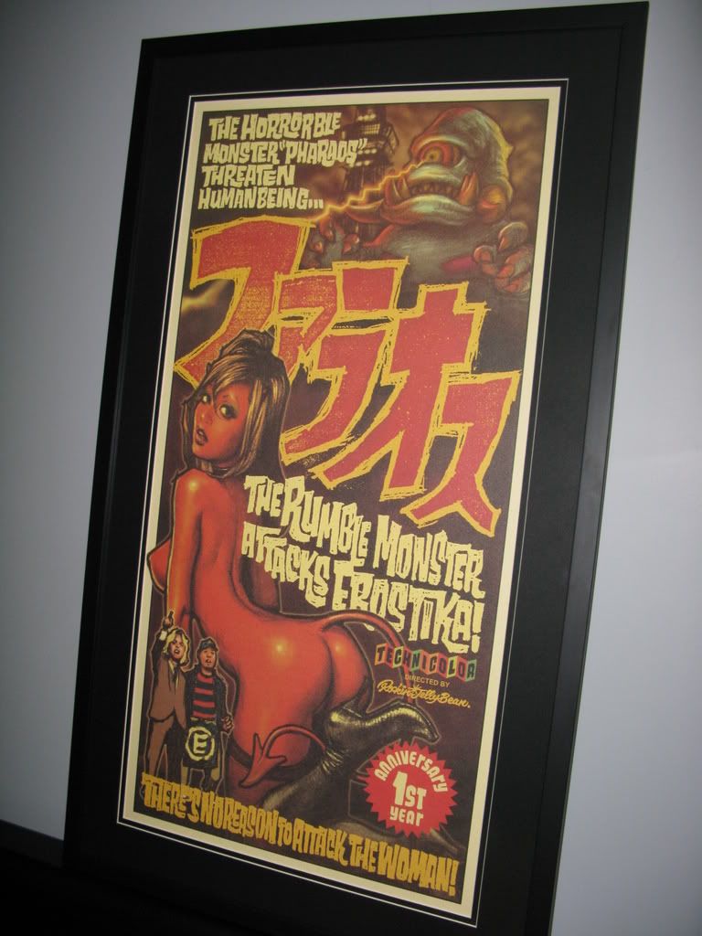
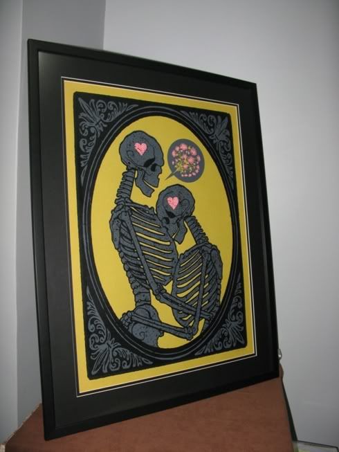
Two gorgeous offset prints from the very talented Japanese artist Rockin' Jelly Bean (RJB). These were bought in Tokyo by Uncle Bill and lovingly hand-carried back to Singapore.

Picture intrepid tech journalist Billy Teo stalking the narrow steets of Harajuku in his trademark light blue shirt and chinos, descending into the Austin Powers psychedelia that is Erostika, RJB's hard-to-locate basement store. What a sight... Uncle Bill, thanks again! I bet you enjoyed the experience though...

The prints are on pale yellow paper, so I went with black matting. They turned out great, and I couldn't have been happier. These rank up there among my favourites, I only wish RJB had signed them.

Click here to read an interview with RJB, or here to visit his official site.

Frank Kozik: Mermen


I'm not a mega Kozik fan the way I'm nuts about Jesse Philips or Dan McCarthy (I like pretty much everything these guys roll out). This is but one of the two Kozik prints I own (the other being "The Iron Dream", which is much more interesting and/or controversial, depending on how you see it). I bought it because it had a drunken sailor, he-man like sea creatures and tentacles, which sound to me like a good receipe for a poster any day of the week.

This is a great example of how posters in the flesh always tend to look better than their scans. Here is the original scan which I based my purchase decision on. The actual poster turned out to be tons more vibrant, with mind-blowing fluorescent pink and yellow inks.

I got this from Lone Star Posters, and I figured I'd mention that because I linked to his scan. John is a great vendor. He replies emails prompty, and ships international without overcharging. If you live outside of the US, you should definitely check his site out.

Monday, May 12, 2008

Pandas and skulls


This is special. It's a birthday present from my pal and tattoo artist Elvin Yong. Elvin goes great tattoos; he's usually know for his realistic stuff, but as this drawing shows, the dude can knock out a wicked cartoon too.

Ink on A3, framed with single black matte and reflective glass. I've always framed with non-reflective glass, but this was given to me framed. It's interesting though, to see the subtle effects the different glass makes. Non-reflective glass makes it easier to view, but reflective glass makes things look expensive somehow.

Click here to see more of Elvin's tattoos and sketches, and give him a call if you want some ink from Singapore.

Sunday, May 11, 2008

Bunny madness from Kozyndan


Bunny Blossom


Uprisings

Deviating somewhat from my typical poster choices by being pastel and full of cute little critters, Bunny Blossom and Uprisings are offset prints from LA based husband and wife team Kozyndan.

Uprisings pays homage to Hokusai's famous woodcut print "The great wave off Kanagawa", with Kozyndan's signature bunnies added in for good effect. I'm not sure about the origins of Bunny Blossom, but it seemed like a good companion to hang up next to Uprisings.

Both prints are signed open editions, so click here to see the original scans and to buy em.

Wednesday, May 7, 2008

Punchgut Studio: Electric Frankenstein


Piss-takes of the famed Che Guevara photo (taken by Alberto Diaz Gutierrez) have appeared in various guises all over the pop culture landscape. Here's Punchgut Studio's intepretation, a nice bold print complete with neck bolts and stitches. Click here to see the original scan, and if you're lucky, you might still be able to get a copy from the Punchgut website.

Like the Dr Alderete print shown below, this was framed with no matting, so only time will tell if it will hold up.

Looking at photos of both frames makes me realize that accurate size is difficult to judge. Although they look roughly the same size from the photos, blue lucha man is easily more than twice as large as Franken-che.

Lucha libre poster by Dr Alderete


Well it's not exactly titled "Lucha libre", but "El Sagrado Corazon Del Catchador" wouldn't fit. I love the bold, stylistic visuals done by Dr Alderete. The blue really leaps off the print in person, and at this size (26" x 34"), makes for a visually arresting piece.

I'm a big fan of Dr Alderete's work, but I haven't been able to find out much about him due to his site being under construction. I only know he's based in Mexico, and that his first name is Jorge. You can browse his old site here.

I bought this print from a French site called Black Cat Bones, but you should also check out Brazos Negro's website. He's the guy responsible for printing this and the rest of Alderete's work.

This was one of the first posters I framed. My newbie mistake was not using any matting or spacers to keep the glass off the print. I'm keeping my fingers crossed that this lovely piece can withstand the humid tropics.

Sunday, May 4, 2008

Two from Jesse Philips


The Epoxies & the Phenomonauts


Launchpad B-day Bash 2005

I collected these two prints on Saturday. These are by Jesse Philips. I've got a couple of other Jesse Philips prints which I'll post once I've taken photos, but he really does great giant robots/mass hysteria/alien tentacle/samurai thingys well. Click here to see the original scans, and more of Jesse's stuff.

I chose to frame these first out of all my unframed stuff because they're printed on really heavy, almost card-like stock, which makes rolled-up storage difficult. Anyone knows why such paper is used? I notice its usually my taller, narrower posters which are printed this way.

Friday, May 2, 2008

Johnny Crap: Big Freakin' Skull


Johnny Crap hails from Montreal and does sweet stuff with hot rods and skulls. This is my first original art purchase, and my first Johnny Crap.

This illustration reminds me of old wood block prints, and the art in old children's story books. I can imagine this in an Enid Blyton book if she was into giant calaveras instead of pixes and fairies.

There was some miscommunication with the frame shop and it ended up having a black matte. I'd originally wanted white, but black seems to work well too.

Click here to see the scan on Mr. Crap's blog.

Jeff Kleinsmith: Melvins, Trevor Dunn's Trio Convulsant


I've had this for a while, but only recently had it framed. It's complicated... my regular frame guy isn't into gigposters; he usually frames up jigsaw puzzles, wedding photos and chinese brush paintings.

I may never hang this up, but its a giant phallus spewing toxic goop, and I just had to own it.

The framing for this left me on the fence. I think I went a little too thick with the width of the matting board, and I'm not sure if I should have matted in black.

Click here for more of Jeff Kleinsmith.

Dan McCarthy: Let it Be


I got on the McCarthy bandwagon pretty late, so I paid a pretty penny for this. I also subscribed to his 07/08 poster club at the start of the year, and I gotta say, thats about one of the smarter poster purchases I've made to date.

I chose to frame my copy of Let it Be with 2 layer black matting, if memory serves me right, this is 2 1/4 " (or 2 3/4" ) thick .

I think the framing adds to the print, and I'm really happy how it turned out.

See the original print here: